Matcher
How asking learners a few questions beat our best search filters.
- The problem
- Over 100,000 tutors to choose from, and learners who mostly ignored our search filters.
- The bet
- A short, adaptive questionnaire that narrowed down options and increased confidence and brand trust.
- The result
- A measurable lift in paying customers, and the start of a personalisation strategy that outlived the project itself.
- My role
- Led design from research to first prototype, rollout and follow-up iterations, partnering with the PM on the personalisation strategy.
The needle in a haystack
Preply had grown into the largest online tutoring marketplace in the world. Great problem to have, except for one thing: how do you pick one tutor out of 100,000?
Most people didn’t. They opened the search page, looked at a wall of profiles that all seemed reasonable, and either guessed or gave up.
We had built a good search engine for people who already knew what they wanted. Most learners didn’t know yet. They needed something closer to a conversation than a search bar.
Hardly anyone used the search filters on offer, and most people who searched never converted.
A question, not a search bar
The idea was simple: what if, before showing anyone a single tutor, we asked a few questions about what they were actually trying to learn, and how?
The answers would map to our existing filters and quietly pre-select them, so the results page would already feel personal by the time someone saw it.
The uncomfortable part: this meant putting more steps between a visitor and the tutors listing, on a page whose entire job was conversion. Every instinct in growth design says the opposite: remove friction, get out of the way. So we treated it as a learning experiment rather than a launch, with a short list of honest questions:
- Would people choose to answer questions before seeing any tutors at all?
- Which questions would they answer, and which would they skip?
- How far would they go for a more personal result before giving up?
We shipped a plain, unstyled 8-step wizard. No animation, no charm, just questions. Fully expecting the data to tell us to scrap it.
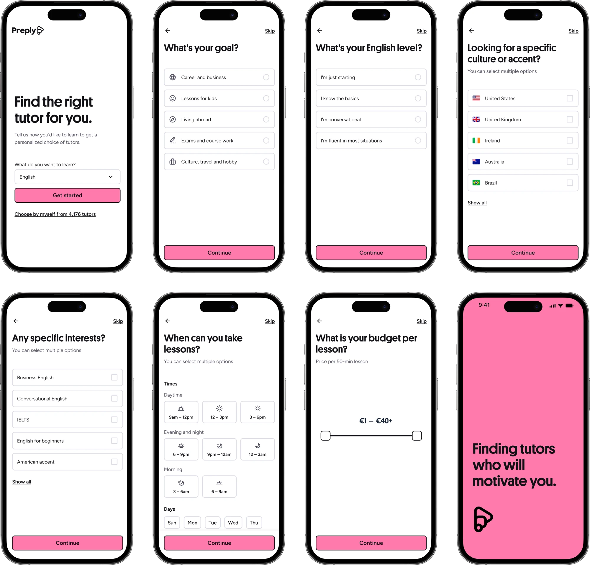
The eight screens of the original, unstyled wizard.
The gatekeeper effect
But it backfired in the best possible way.
Conversion to paying customers rose noticeably, mobile conversion rose even more, and most people who started the wizard finished it — converting faster than they had through search alone.
The clearest signal came from paid search, our highest-intent channel. Fewer people finished a search overall, which we expected. But the ones who did were far more likely to become paying customers.
The wizard wasn’t just collecting preferences: it was sorting people. Learners who were only half-curious dropped off early, which was fine, as they were unlikely to convert either way. Learners who were serious used the questions to narrow 100,000 tutors down to a shortlist they actually trusted, and moved forward with confidence.
Added friction, done deliberately, had made the funnel more trustworthy rather than less efficient.
From experiment to strategy
A good result from a scrappy test tends to generate enthusiasm fast, and this one surely did. The harder job was ahead: turning “this test worked” into “this should shape the product.”
Together with the PM, we used the proof of concept as the opening argument for a broader personalisation strategy: collect a learner’s goals once and let that information travel with them — from search to onboarding, through their first lesson, even as a way to keep them motivated later on when the novelty of learning with a tutor starts to wear off.
To pressure-test the strategy, I ran a series of workshops with more than 20 stakeholders from across the company, together generating 148 ideas worth exploring.
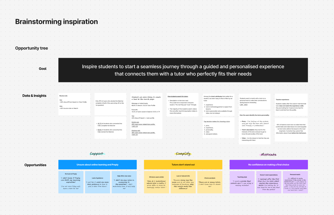
Excerpt from the personalisation strategy workshop.
I also pushed a slightly less obvious point: this shouldn’t be treated as a utility. For a large share of new visitors, this questionnaire was their first real interaction with Preply. Done well, it was a powerful brand moment, not just a wizard.
Giving it a face
The timing helped. Preply was mid-rebrand, with a new visual identity taking shape across the product. I partnered with the brand team and a motion designer to turn the plain questionnaire into something with a personality of its own, which we called, internally, the Matcher.
The finished Matcher experience, end to end.
The finished version used playful animated illustrations and adapted its own questions based on what you’d already answered, so it felt more like a conversation than a form. Completion and engagement both went up again.
It was later featured on Built for Mars as an example of UX craft, which was a nice moment, mostly because it meant someone outside the building noticed the same details we’d obsessed over inside it.
The animated illustrations that bring each step of the questionnaire to life.
The gift that keeps on giving
The Matcher didn’t stay finished for long. It became a live surface for dozens of smaller experiments: new questions, new logic, usability and performance improvements, new ways of using what learners told us. Preply’s CPO took to calling it “the gift that keeps on giving” — well-deserved praise for a humble feature that surfaced new opportunities, made a significant impact on the business, and reflected the hard work of the whole team behind it.
Longer term, data from the Matcher fed Preply’s matching algorithm and personalised learning journey, well past whatever budget was originally signed off for “an 8-step wizard.”
What I took from it
Added friction isn’t necessarily bad. It’s bad when it protects the business at the user’s expense, and good when it helps someone make a decision they’d otherwise have guessed at.
People are more willing to invest in a relationship before they’ve seen the product than most funnels give them credit for, as long as it feels in service of them, not just of your conversion rate.
A humble proof of concept can be a great way to find out whether an idea deserves a better version. Our questionnaire certainly didn’t look like much in its first week, but it turned out to be exactly what we needed to strengthen our conviction around the initiative.
Sensitive business information was redacted from this version of the case study. Reach out and I’ll share the numbers behind it.