Students hub
Giving tutors a student-centric view of their business.
- The problem
- Tutors run their own small tutoring business inside Preply, but had no proper view of their portfolio.
- The bet
- A proper Students hub, with the student profile designed as one shared, customisable component for the whole product.
- The result
- Meaningfully higher tutor engagement with the page, and better-prepared, higher-quality trial lessons.
- My role
- Led design end to end, and owned the shared Student profile’s architecture as adoption accelerated, partnering with the PM and the tech lead.
A business tutors couldn’t see
Every tutor on Preply is, in effect, running their own small business. Dozens (or even hundreds) of students, each on their own schedule, subscription and level.
The product didn’t give them a centralised place to hold that information and manage their students, so every tutor chose their own methods: Google Docs and spreadsheets, pen and paper notes, virtual boards, or a mix of all of those. Inside the product, tutors leaned on “My lessons” for almost everything.
It covered the basics: past lessons, future lessons, price. But it had real gaps: no subscription info, no tutoring history, and tutors found it genuinely hard to use for anything beyond scheduling.
What tutors actually needed
Before designing anything, we went and talked to tutors. What came back were three fairly unglamorous but very real jobs to be done: know your students well enough to personalise lessons, understand your income and what each student contributes to it, and understand how engaged, and how likely to renew, each one actually is.
“I take notes about their background and interests. When you have 5 or 10 students, it’s easy to remember. After 15, it gets harder.”
Esmeralda, Spanish tutor“It might not be the easiest way, but it could be cool to have the stuff centralised. I have notes everywhere.”
Mark, English tutor“I want to know how committed they are and put a real number behind it. It would tell me which students need more of my attention.”
Ting, Mandarin tutorProving the direction
Before asking engineering to build anything, I put together a fully working, mid-fidelity prototype using Magic Patterns, an AI prototyping tool. It was early 2025, and this was the first fully working AI-built prototype at Preply.
Being able to click through a real flow rather than react to static screens made it just as useful for testing the concept with tutors as it was for building conviction and buy-in with the extended leadership team.
The mid-fidelity prototype used to test the concept with tutors and leadership.
“I love the students showing side-by-side. It feels like I’m seeing them right in front of me, like in a classroom.”
English tutor while testing the prototypeTurning a list into a worklist
Concept validation and a product review with the leadership team led to a number of changes before we landed on the version that shipped as the MVP: repurpose “My lessons” into a proper “Students” hub, segment students into Current and Archived, and surface on the main view only what tutors actually cared about: price, lessons balance, next lesson, subscription type.
A walkthrough of the redesigned Students hub.
None of this existed in “My lessons”: student search, sorting and filtering, subscription status at a glance, and full price history for every student.
The detail I’m most proud of is coming up with the “Next best action” column. Instead of asking tutors to dive into each learner to find out their next move, each row tells a tutor what they should focus on: give feedback, share homework, suggest a top-up, plan the next lesson. It turns “here are your students” into “here’s what to do about them today”, a small shift in wording but a real shift in what the page is for, and a great challenge for our data science team, who had to build the algorithm behind it.
One profile,
wherever you need it
Clicking into a student opens an in-depth side profile: Details, Lessons, Progress, Revenue. Notes are split into a short AI-assisted summary and lighter details like hobbies. Small, but it means a tutor can walk into a lesson with some important student details in mind, allowing them to build a stronger connection and create a more personalised lesson.
The profile panel wasn’t designed only as a Students-page feature, it was planned from the start as a shared piece of interface that would show up anywhere a tutor was already looking at a student: Home, Classroom, Messages. Same tabs, same information, same actions, regardless of where you opened it from.
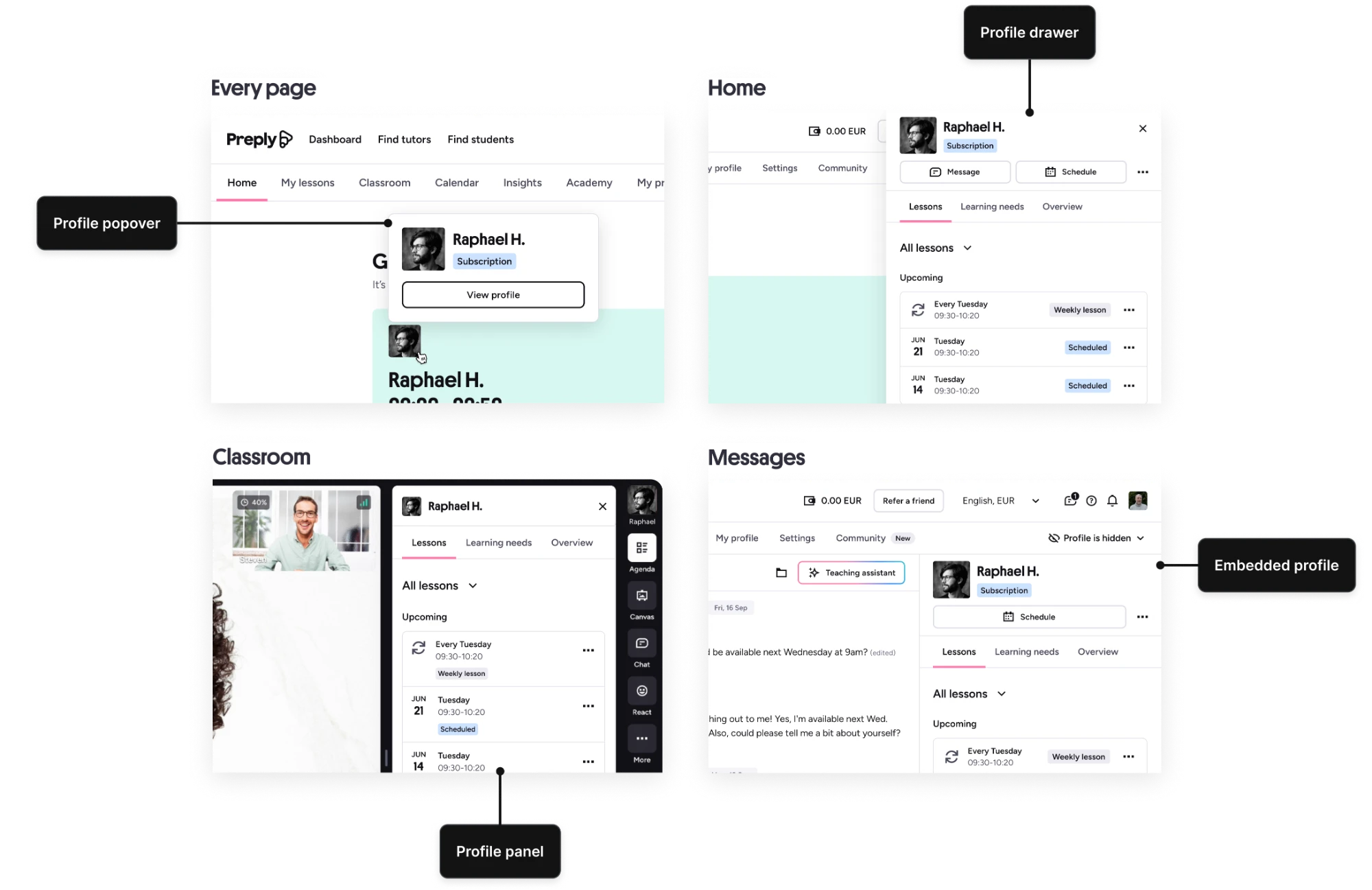
The same student profile, wherever a tutor meets a student.
Built to scale,
forced to scale fast
We’d designed for extensibility from day one. What we hadn’t planned for was the pace: teams wanted to build on the profile faster than the underlying architecture was ready for. Getting that architecture properly defined, rather than letting each team bolt on its own tab as they went, turned from a “later” problem into its own spin-off initiative. Without that, the profile would have ended up, within a few months, with fifteen tabs nobody could navigate, each shaped by a different team optimising for their own corner.
My job shifted at this point from designing the next iteration of the hub to defining the system and the architecture of the profile, and building consensus around what it would host but, especially, what it shouldn’t.
That meant taking on the less visible, harder part of the job at speed: working through open questions with partner teams about what’s critical versus optional, what guardrails keep customisation from turning into chaos, and running a design jam to get everyone looking at the same coherent vision instead of their own slice of it.
A prototype of a potential version of the profile, opening other tools while still feeling like one experience.
Empowered tutors, better learning outcomes
The new page was quickly picked up and praised across the tutor community. Quick and consistent access to student information helped tutors better plan their lessons, prepare personalised trials for new students, and get a comprehensive overview of each one.
“The new students page is goated as hell, and the design/dev team deserves a gold medal and a trip to Bali.”
Alexa, in the Tutor Conference chat- Noticeably higher tutor engagement with the page.
- More trial lessons rated “Good” or “Outstanding”.
- Improved tutor efficiency and focus on teaching.
- More critical actions taken directly from student profiles.
- Learning needs helped tutors better prepare for trial lessons.
Two moments of celebration in the profile, meant to delight tutors: a lesson milestone and a tutoring anniversary.
What I took from it
The quote “After 15, it gets harder” is a good reminder that not every problem needs a clever solution. Sometimes people are simply asking you to help them keep track of what’s relevant.
A shared component is a promise, not just a UI pattern. The moment you tell several teams “build on this”, you’ve taken on the job of protecting the thing that made it useful in the first place: relevance and consistency. That’s not a one-off decision, it’s ongoing upkeep.
The best feature on the page wasn’t a new piece of data, it was one column that told tutors what to do next. Sometimes the highest-leverage thing you can add to a list is a verb.
Sensitive business information was redacted from this version of the case study. Reach out and I’ll share the numbers behind it.