Insights reimagined
One week, no roadmap, and three years of built-up assumptions to challenge.
- The problem
- A three-year-old performance dashboard tutors used daily and said they liked, while quietly feeling confused and judged by it.
- The bet
- A solo, unconstrained redesign built in one quiet week, then pitched as the ideal version to get pieces of it greenlit.
- The result
- Didn’t get the full redesign, but got the promise to experiment with at least three of the opportunities uncovered during the exercise.
- My role
- Spotted the opportunity and ran the whole thing solo over roughly a week, presenting progress and gathering feedback from key stakeholders.
A page tutors said they liked
Preply’s Insights page is where tutors go to understand their own business performance: how visible they are in search, how their lessons are going, whether they’re on track to keep their Super Tutor status. It had been built three years earlier, and whenever we asked tutors about it directly, the answer was reassuring. It was relevant. They checked it daily, on desktop and on the app. Nobody flagged it as a problem.
A walkthrough of the Insights page before the redesign, with annotations.
What the surveys weren’t catching
I went looking somewhere surveys don’t reach: our tutor community, an internal space closer to a Facebook for tutors than a feedback form. Reading through posts and questions about the Insights page specifically, a different picture appeared. Tutors were confused about what half the 21 metrics on the page actually meant, or which ones affected their search ranking or Super Tutor status. And a fair few felt judged by it: many metrics were framed as failures (“you didn’t do this”), which read as patronising rather than helpful.
Looking at Amplitude data, I noticed that 84% of tutors scrolled all the way to the bottom of the page daily just to see their earnings — the thing they cared about most, buried 1498px down the page.
Naming what wasn’t working
I turned my own annotations, past research and the community posts into four clear problems:
- Punitive framing: failure language, red warnings, few actual solutions offered
- Backwards-looking: mostly historical data, recommendations hidden behind clicks
- Fragmentation: 21 metrics with no prioritisation or story connecting them
- A blind spot on retention: plenty of metrics about winning new students, none about keeping them
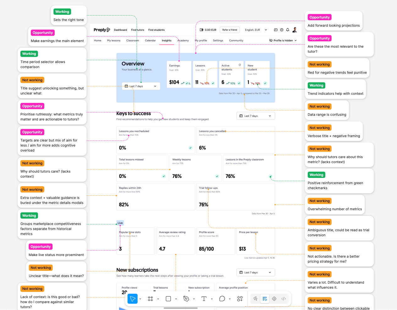
My annotations on the original Insights page.
Borrowing from outside
Rather than guess at fixes, I ran an AI-assisted benchmarking pass across 15 platforms with the same underlying problem: paying people based on performance they need to understand. Airbnb reframes shortfalls as “opportunities”. Lyft shows drivers exactly where their earnings come from, down to the dollar. Instacart splits its quality score into things shoppers can actually control. Patreon benchmarks creators against peers their size, so a slow month reads as a market shift, not a personal failure.
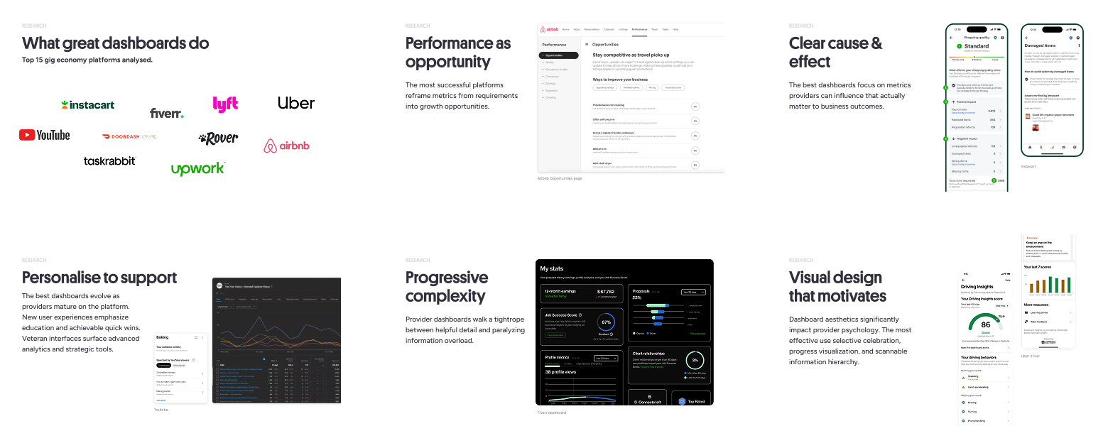
Pages from the benchmarking report.
That research, plus the annotations and community findings, became five guiding principles: earnings first, opportunity over punishment, forward-looking, context over numbers, and personalise thoughtfully. Everything after this point was a test of whether I could hold all five at once.
Building the backbone
The 21 old metrics had no visible relationship to each other. I mapped them into a chain: visibility and profile strength feed acquisition, acquisition feeds retention, retention (alongside earnings) feeds the number tutors actually care about. I also sorted every metric into leading (things a tutor can act on today) versus lagging (results of what they already did), so recommendations could point at the right lever. Metrics that used to sit alone now had a job to do inside that story, split into four sections: how students choose you, how you win new students, how you keep students engaged, and what you’re earning.
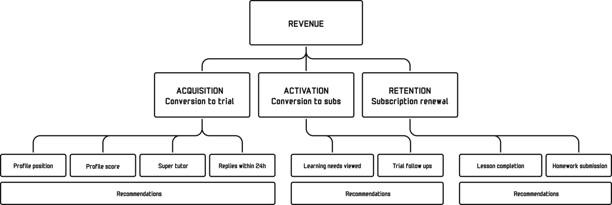
How the metrics connect, and the structure of the new page.
Positive framing meant merging, not just renaming. Three negatively framed metrics (lessons rescheduled, lessons cancelled, lessons missed) became one: lesson completion. And because a brand-new tutor’s story isn’t the same as an established one’s, the order flips for anyone still building their first students: reach and acquisition come first, retention and earnings later, once there’s something to retain.
The reimagined page
At the top, a business-at-a-glance summary leads with earnings and a short AI-generated 30-day recap, following the five-second rule I picked up from the benchmarking: tell tutors what’s working and what needs attention before asking them to dig. Three headline metrics sit underneath, each linking down to its own section and showing how a tutor compares to similar peers. Scroll further and every metric carries a status label (great, good, could improve), and each section has its own “what to do next” list, which adapts to performance: fall below goal on a metric and you’ll see more recommendations aimed at fixing it.
A walkthrough of the reimagined Insights page prototype.
Two additions sit at the bottom, outside the core narrative on purpose. Preply Co-pilot, an AI assistant, digs even deeper, answering specific, personalised questions like “should I change my price?” or “will I keep my Super Tutor badge?” And a “Did you know” section turns a tutor’s own journey into slightly boastful facts they can feel proud of and share with their networks to promote their profile.
Selling a redesign nobody asked for
There was no appetite for touching this page. It wasn’t due, and the next quarter’s roadmap was already locked by the time I finished. So I built the most ambitious version I could, ignoring technical and operational constraints entirely on purpose, and used it to make the case for smaller, inspirational pieces of improvement.
I presented the project to key stakeholders at three points over that week: a strategy session covering the research, benchmarking and the principles; a “structure” review of three potential directions using low-fidelity prototypes; and finally the working prototype. Stakeholders responded well to the summary view, the retention and earnings focus (which matched what tutors were already asking for), and the craft of the UI itself. I didn’t get the full redesign, that was never really the point, but the PM committed to running the AI Co-pilot, the retention metrics, and the earnings-first approach as experiments the following quarter.
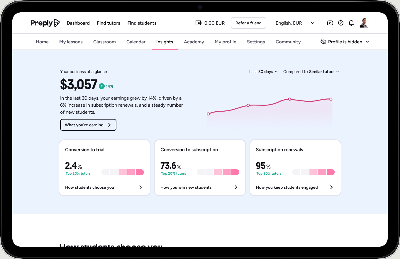
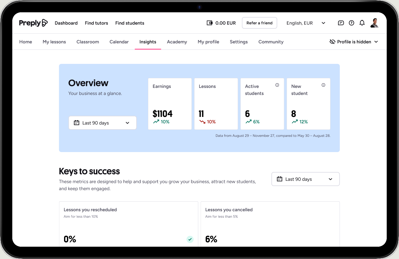
The Insights page before and after the redesign.
What I took from it
Freedom is easiest to justify in hindsight, but at the time it felt like a risk: spending a quiet week on something nobody had asked for. It paid off because I treated the finished, unconstrained version as a pitch, not a deliverable. Ambition is what got people excited enough to fund a smaller version of it.
The most valuable move wasn’t a new feature. It was giving 21 disconnected numbers a story to live inside.
Borrowing shamelessly from outside categories (gig platforms, creator tools, marketplaces) turned out to be far faster than trying to invent tone and structure from scratch.
Sensitive business information was redacted from this version of the case study. Reach out and I’ll share the numbers behind it.